
Pollsters have gotten a lot of grief over getting the election results wrong. There’s reason to criticize, but I think some people are placing blame when it’s not as clear cut as they might think.
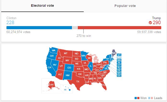
First, it appears that although Trump won the electoral college, Clinton won the popular vote. The national polls aren’t tracking the electoral college votes, they are tracking voters. So, predicting a Clinton win in the national, popular vote turns out to be accurate.
That’s why a lot of experts look at state-by-state polls, which can give a better picture of the electoral count. That gets complicated fast since pollsters have different methodologies with different levels of accuracy.
Secondly, almost all of the polls that are typically cited reported results that are within the margin of error. We often forget about the margin of error when we hear about polls. This may be the biggest error made by the pollsters and the media: not reminding people that every poll has a built-in margin of error.
MARGIN OF ERROR IN ACTION
“For Poll A, the 3-percentage-point margin of error for each candidate individually becomes approximately a 6-point margin of error for the difference between the two. This means that although we have observed a 5-point lead for the Republican, we could reasonably expect their true position relative to the Democrat to lie somewhere between –1 and +11 percentage points. The Republican would need to be ahead by 6 percentage points or more for us to be confident that the lead is not simply the result of sampling error.
In Poll B, which also has a 3-point margin of error for each individual candidate and a 6-point margin for the difference, the Republican lead of 8 percentage points is large enough that it is unlikely to be due to sampling error alone.” – Pew Research
Here’s a further explanation of how this works.
Here’s the Real Clear Politics graph showing 10 polls taken in the days leading up to the election. Every one of them showed results that were within the margin of error for candidate tracking – meaning it was a toss up. Only the Reuters/Ipsos poll from 11/2-11/6 put Clinton clearly ahead (margin of error of 2.3 and Clinton at +5). Even that though was reasonably reflected in the popular vote.
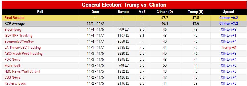
Interestingly, the only poll that favored Trump was the LA Times/USC Tracking poll which had Clinton ahead by 3. It also had the largest margin of error at 4.5 and was also within the margin of error.
Nate Silver, editor in chief of FiveThirtyEight.com, is heralded for his ability to predict Presidential elections. In 2008, he accurately predicted the outcome in 49 of 50 states. In 2012, he got all 50 states correct. Silver and his team are taking heat right now for this graphic, which appeared the day of the election and weighted the election clearly in favor of Clinton. It got a lot of buzz.
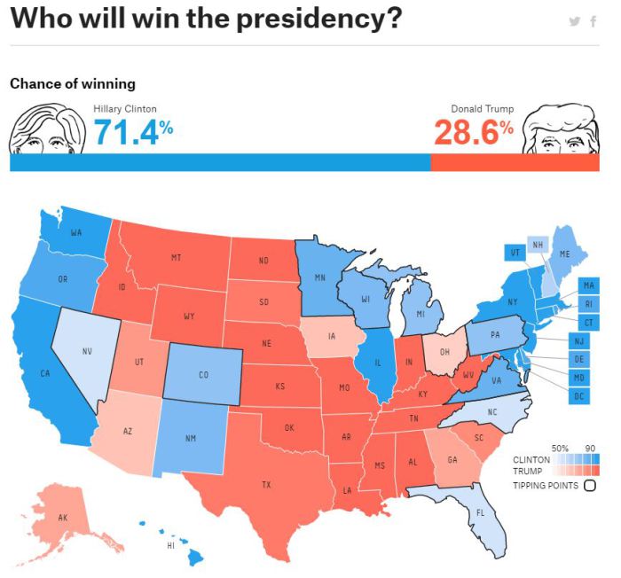
While it showed Clinton to be a 71% favorite, it still gave Trump a chance to win… and win he did.
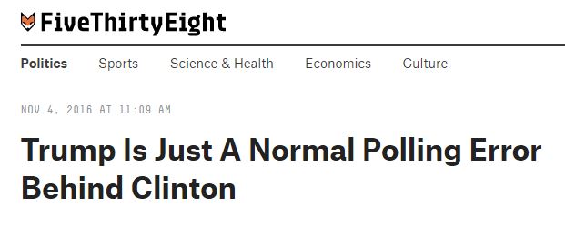
Still, Silver’s team pointed out the fragility of it all with this headline on November 4th,
pointing out that Clinton’s lead over Trump was within a “normal polling error.” That headline didn’t quite make the same splash that the graphic above did.
Now I’m not suggesting that all the pollsters and experts accurately nailed this thing. You would think some of them would have at least been a little closer – and leaning Trump – instead of 9 of 10 leaning Clinton.
Maybe the underlying message in all of this is that the way the pollsters, experts, and media talk about the polls has to change. A better understanding would have underscored what the polls were really saying. What wasn’t said turned out to have a bigger impact on the accuracy of the polls than what was.
The data gurus and the media missed their opportunity to educate people on how this all works. In the progress, they got a black eye and lost just a little more of the public’s trust in accuracy, credibility, and trust.

Leave a comment